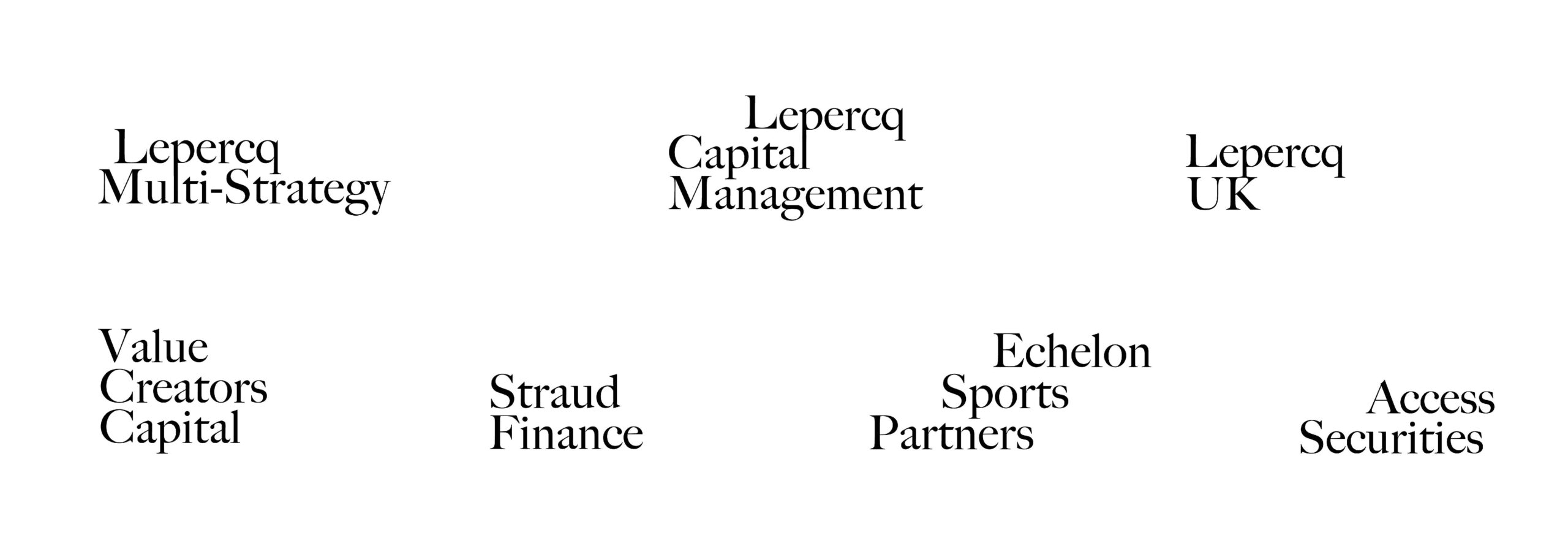
Lepercq Group is a privately held investment firm that seeks to compound its family capital through its investment strategies and partnerships. We had the honor of developing their brand identity, guidelines, and website. This project was lead by Poppy Gordon and Simon Douaire. The website was designed and developed together with Andrew Carlson and Jay Roeder.
![]()
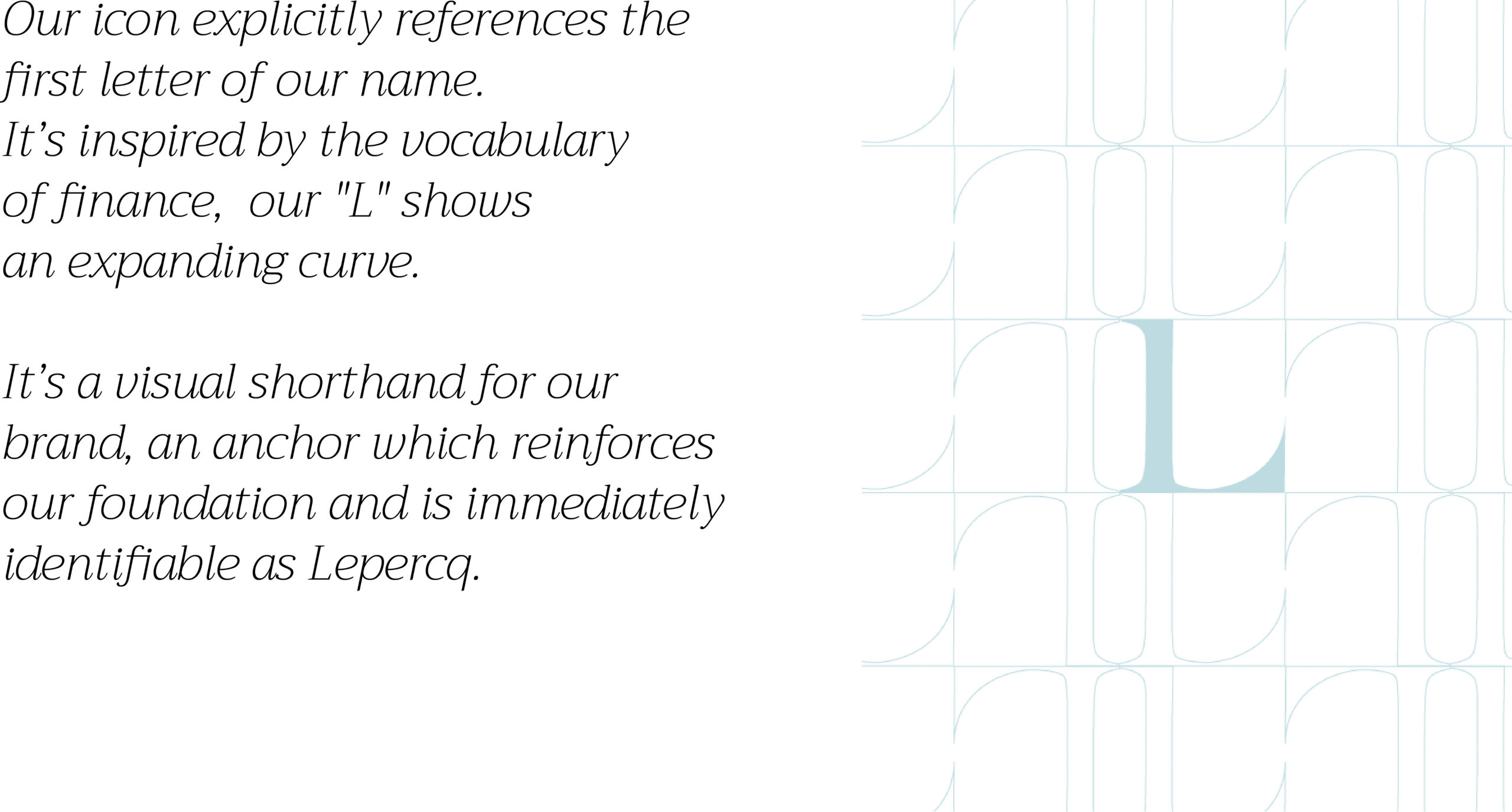
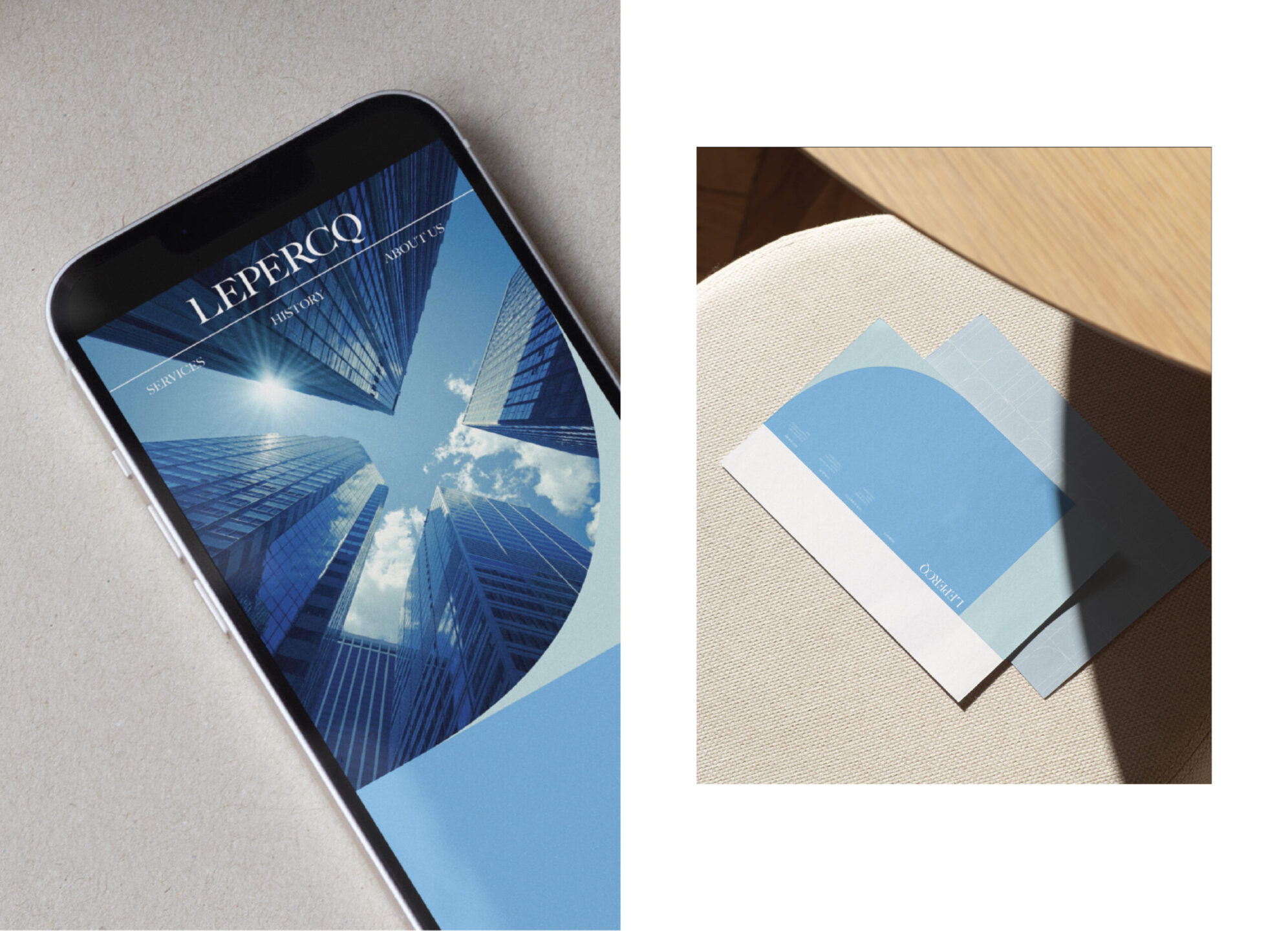
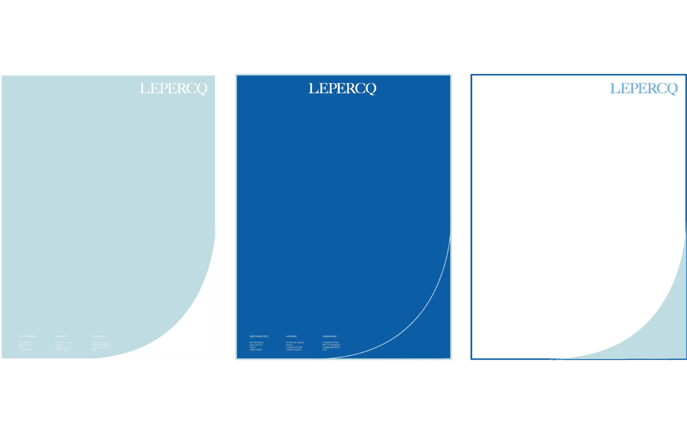
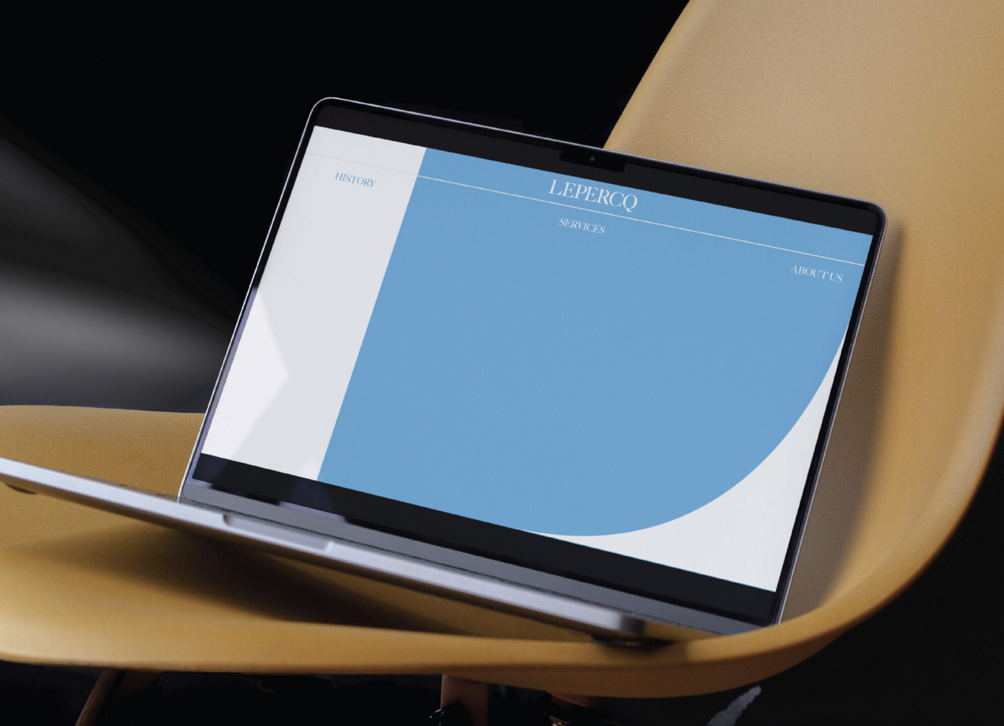
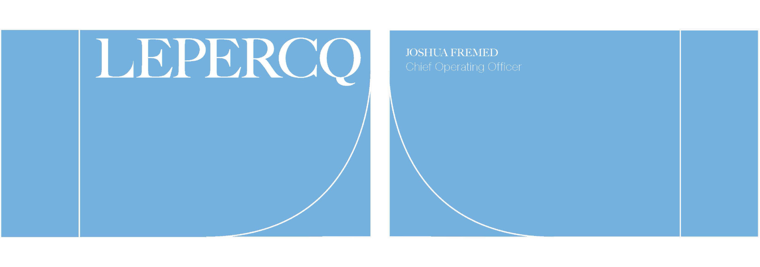
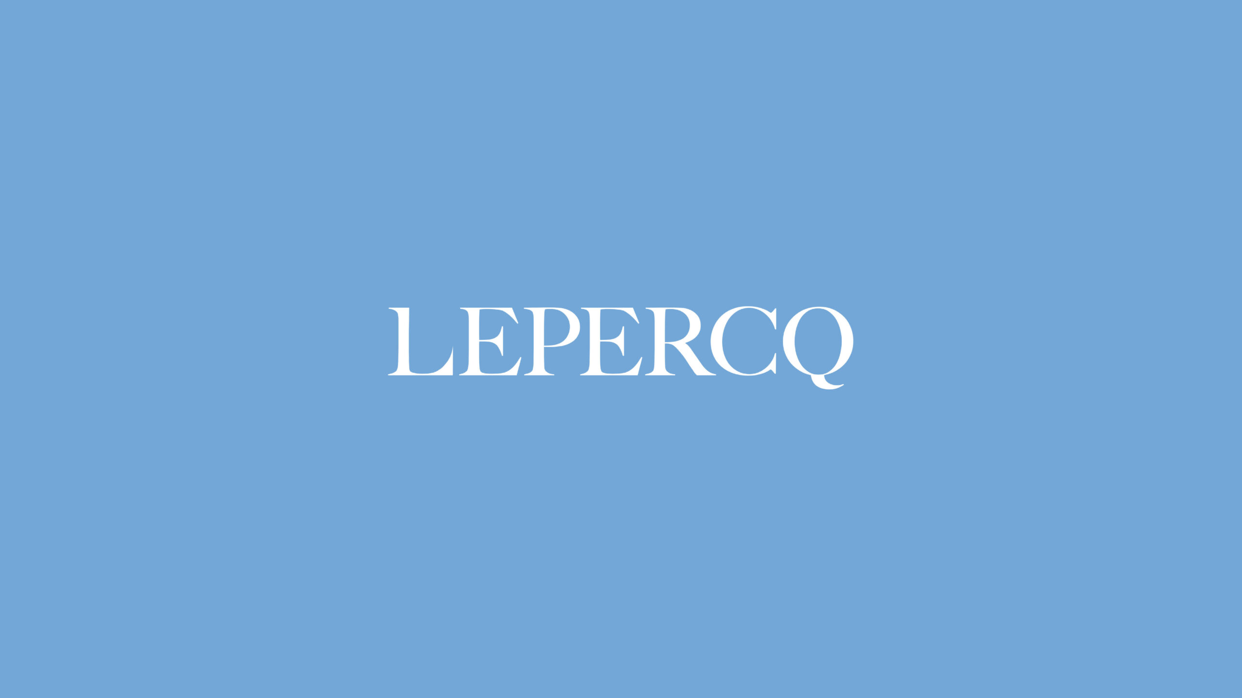
Our redesigned logo represented our newly refined identity, reflecting our relevance in the world of finance today. We’ve evolved from a logo with different interpretations to a statement of strength and confidence, embracing a uniquely bold typeface with our customized L. Current and timeless.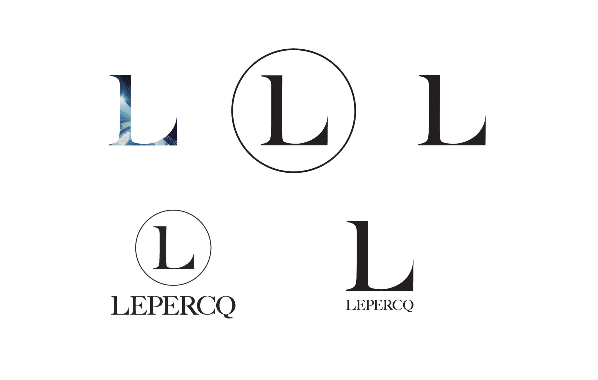 The L was designed to constantly evolve while staying recognizable. Versatile, modular and dynamic. Its simplicity and utility allowed it to be used alone or together. The myriad ways the L could be utilized allowed us to define and redefine Lepercq.
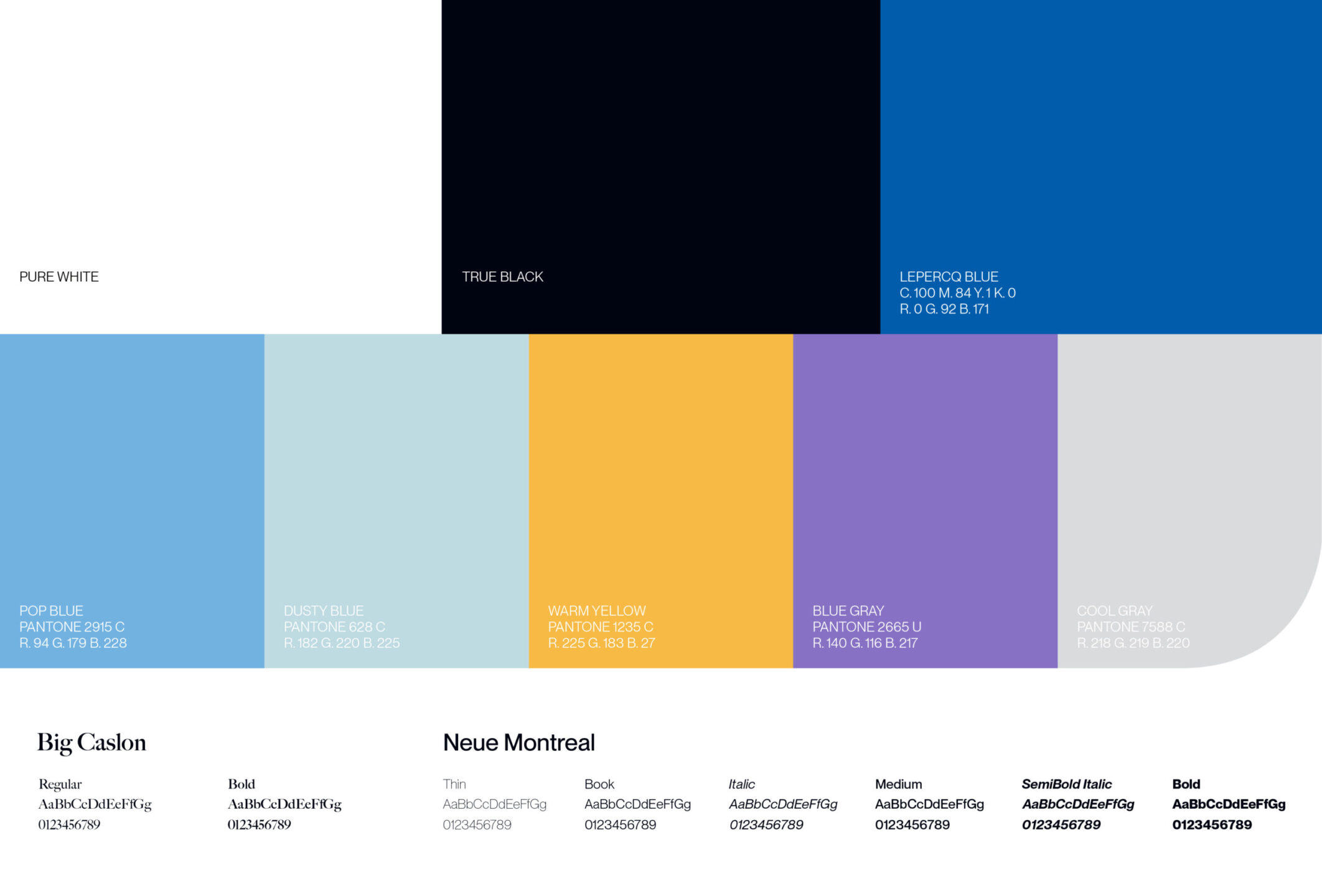 The Metropolis Blue Hour was our inspiration, and the source for building our palette. Our colors were culled from the skyline, the streets, the structures and the ever changing sunrise of city. We choose to use them inharmony, rather than on their own, finding beauty in the contrast.